

Most Popular
-
1
Yoon sorry for shortcomings but insists policies were right

-
2
1 in 3 Koreans live alone, family types becoming diverse

-
3
Korea, Japan finance chiefs vow to tame rampant FX market volatility

-
4
US 'incredibly concerned' about suspected NK-Iran military ties

-
5
Korean won weakens amid heightened uncertainty


-
6
Sewol victims commemorated on tragedy's 10th anniversary

-
7
K-pop group's manager dismissed for setting up spycam in theater dressing room

-
8
Chanel, Louis Vuitton see muted growth in Korea

-
9
K-pop singer lost consciousness after being hit by foul ball, cancels show

-
10
Conservative bloc divided over Han’s role in election defeat


[Herald Interview] Designing cover of BTS’ ‘Map of the Soul: 7’
One of biggest records of the year came in septet’s seventh year with cover that captures group’s history and identity
By Yim Hyun-suPublished : May 6, 2020 - 15:55
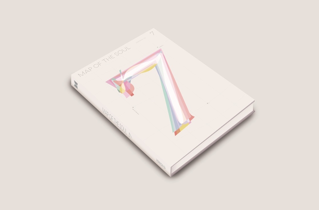
In February, BTS released the group’s fourth studio album “Map of the Soul: 7,” selling over 4 million copies within days of release.
In numerous interviews, leader RM has said the No. 7 symbolizes both the number of bandmates and years they’ve spent together.
“In a way, the biggest inspiration was the story of the BTS members and the seven years they spent together,” A Ji-hye, one half of graphic designer duo Sparks Edition, said in a recent interview with The Korea Herald at their studio in Seoul’s northern Seongbuk-gu.
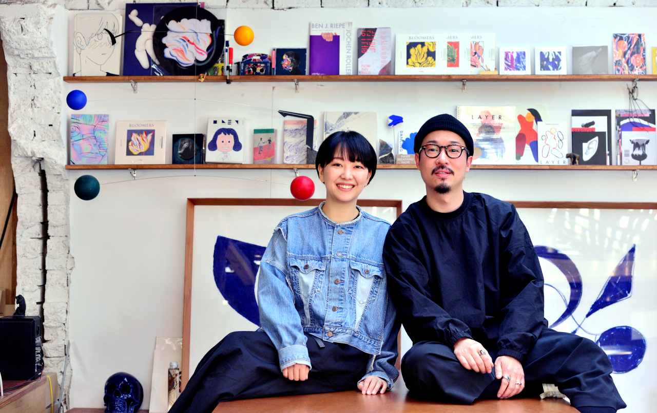
Named after British band Coldplay’s 2000 song “Sparks,” the duo comprising A and her husband Jang Joon-oh took on the job of designing the album cover for the biggest boy band last year, months before the album’s release.
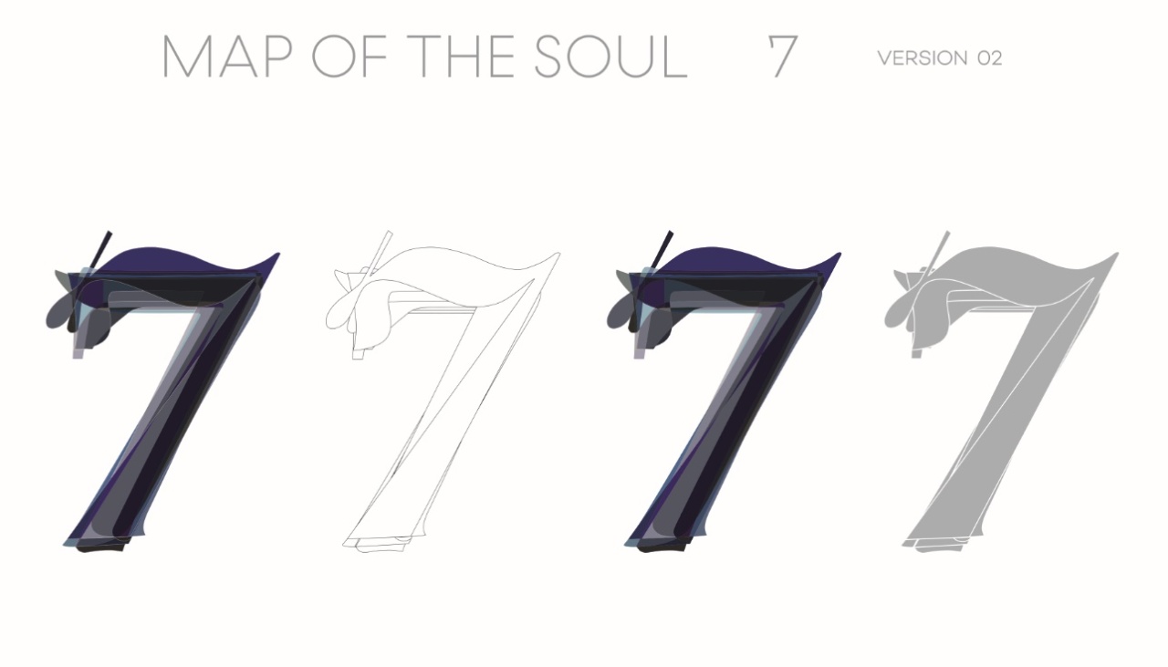
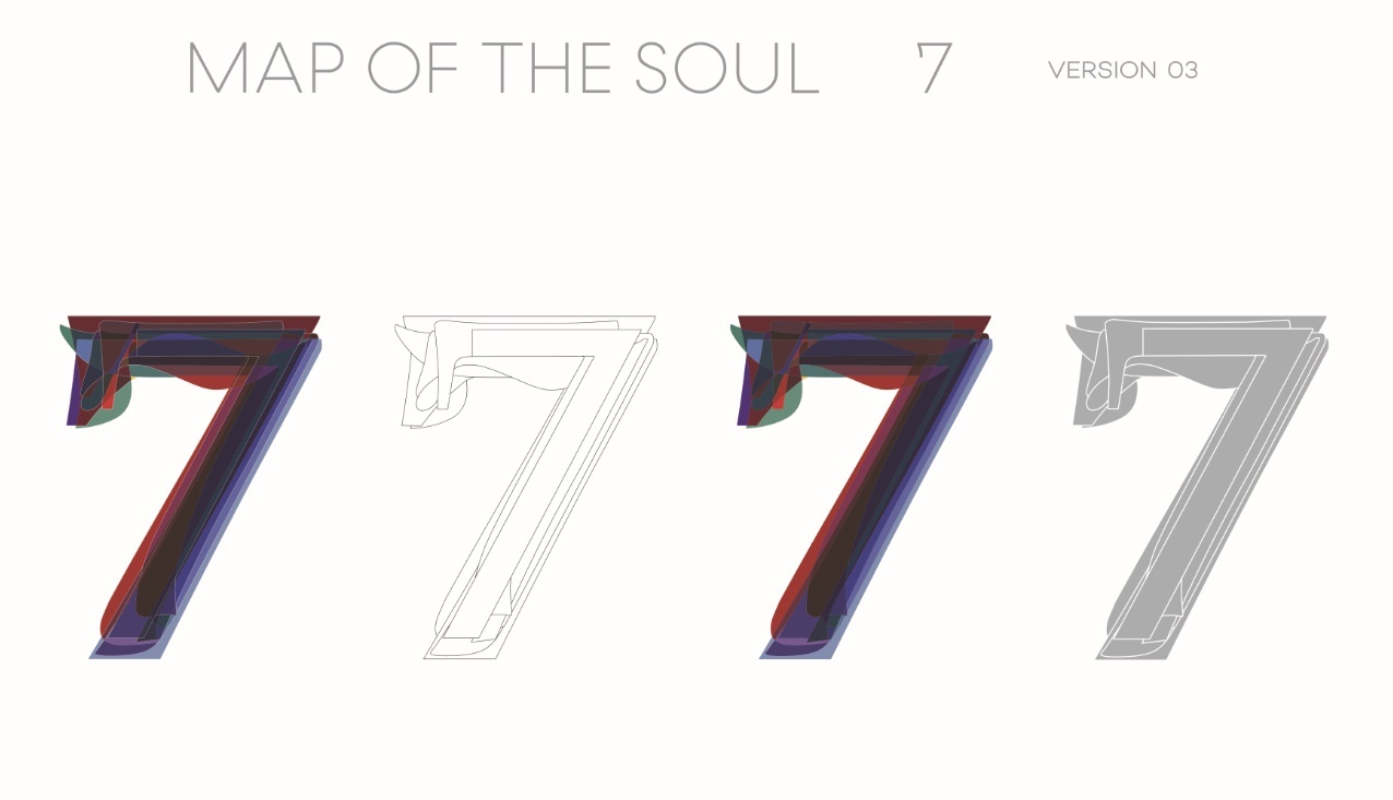
And to capture the essence of what “seven” means to BTS, a direct request from the group, the team turned to layering.
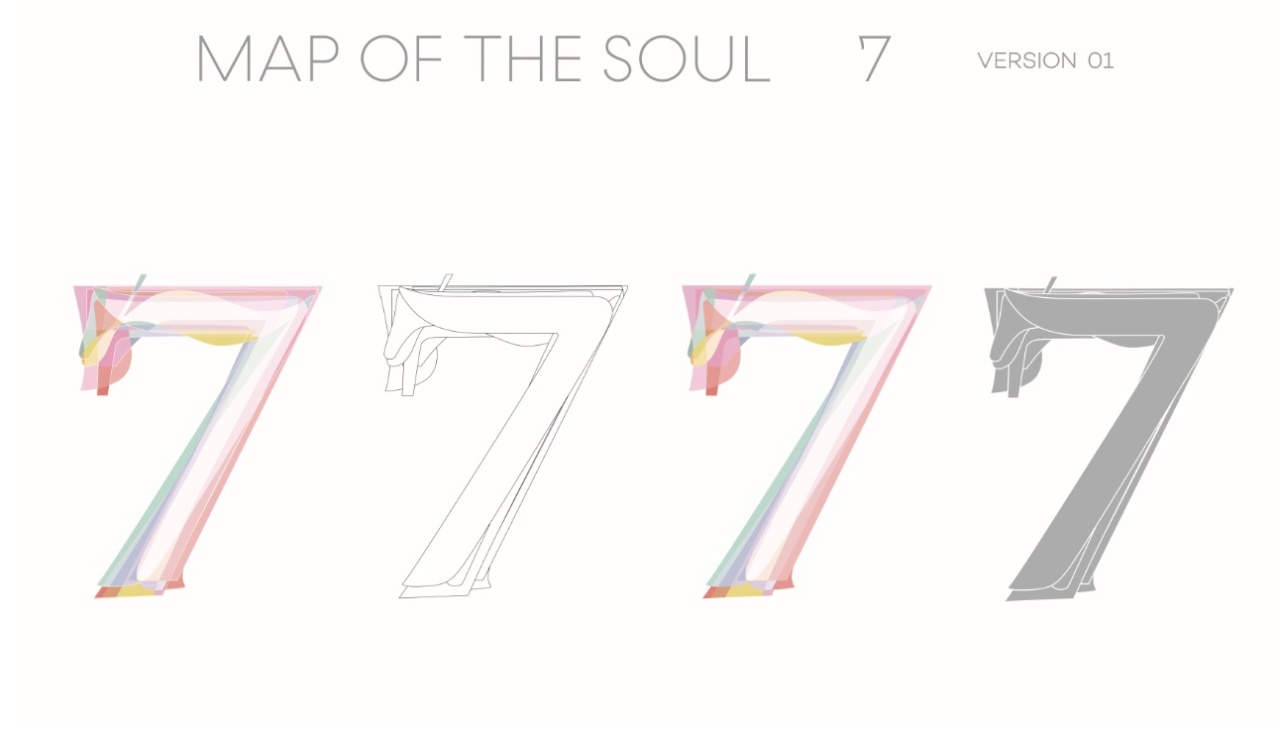
“With the seven members having spent seven years together as a group, we wanted to use layers to create a flattened ‘7’ which embodies an accumulation of their shadows, personas and stories,” A said.
The duo worked on the project by adding layers representing each bandmate based on their identity and personality. And in the end, they came to look like a single-layered seven on all of the four different covers, which A said represents their vulnerability, glamour and sense of duty, as well as their own egos.
And to capture the essence of what “seven” means to BTS, a direct request from the group, the team turned to layering.
“With the seven members having spent seven years together as a group, we wanted to use layers to create a flattened ‘7’ which embodies an accumulation of their shadows, personas and stories,” A said.
The duo worked on the project by adding layers representing each bandmate based on their identity and personality. And in the end, they came to look like a single-layered seven on all of the four different covers, which A said represents their vulnerability, glamour and sense of duty, as well as their own egos.
Getting to know about BTS meant that the two had to consume hours and hours of videos.
“I think for a while we only listened to BTS’ music. Since we needed to establish a story for each member, we tried to study them like a geek,” Jang said with a chuckle.
“We watched a great amount of these fan-made compilation videos of each member on YouTube, as well as concert clips.”
From the back-and-forth with Big Hit Entertainment, studying BTS on YouTube to actually designing the cover, the project took several months to complete.
And during the time, the biggest challenge was to incorporate seven layers of the No. 7 into one design, which meant even the duo themselves didn’t know what the final product would look until the very end.
“The layering wasn’t as easy as we thought since we only had a narrow range of angles to play within and there was a risk of looking too complex,” Jang said as A nodded in agreement.
“We couldn’t just use pretty-looking sevens since we were striving for a design that is both aesthetically pleasing and in line with the concept while relying on subtly different angles and a combination of curves and straight lines. I think finding the balance was most difficult,” she explained.
“It’s the simplest design we’ve worked on in a way, yet has the most stories in it,” A added.

While the duo has taken on numerous graphic design projects including book designs, posters and a fine art exhibition last year, album covers have always appealed to them. So much so that the couple would sometimes buy a record at random based on an album cover just for fun.
“I used to go to record shops a lot when I was in school. They were like the only place where I could go and enjoy amazing artwork in my life at that time,” said Jang, who is a sculpture major, recalling the time when buying a CD at a record shop was much more common, an experience that inspired him to become an album cover designer.
“I used to listen to albums from artists I haven’t even heard of just because of the album cover,” he added, as he praised the artwork for Paul McCartney’s debut album “McCartney” for instance.
In an age of streaming where record shops have all but disappeared from physical retail, the duo still believes in the power of album covers.
“Music is auditory but when we think of the musicians, the images that spring to our minds can be album covers. They are there to visualize the connotations attached to the music, which I think is an amazing cultural work,” A said.
By Yim Hyun-su (hyunsu@heraldcorp.com)


![[Today’s K-pop] BTS pop-up event to come to Seoul](http://res.heraldm.com/phpwas/restmb_idxmake.php?idx=642&simg=/content/image/2024/04/17/20240417050734_0.jpg&u=)